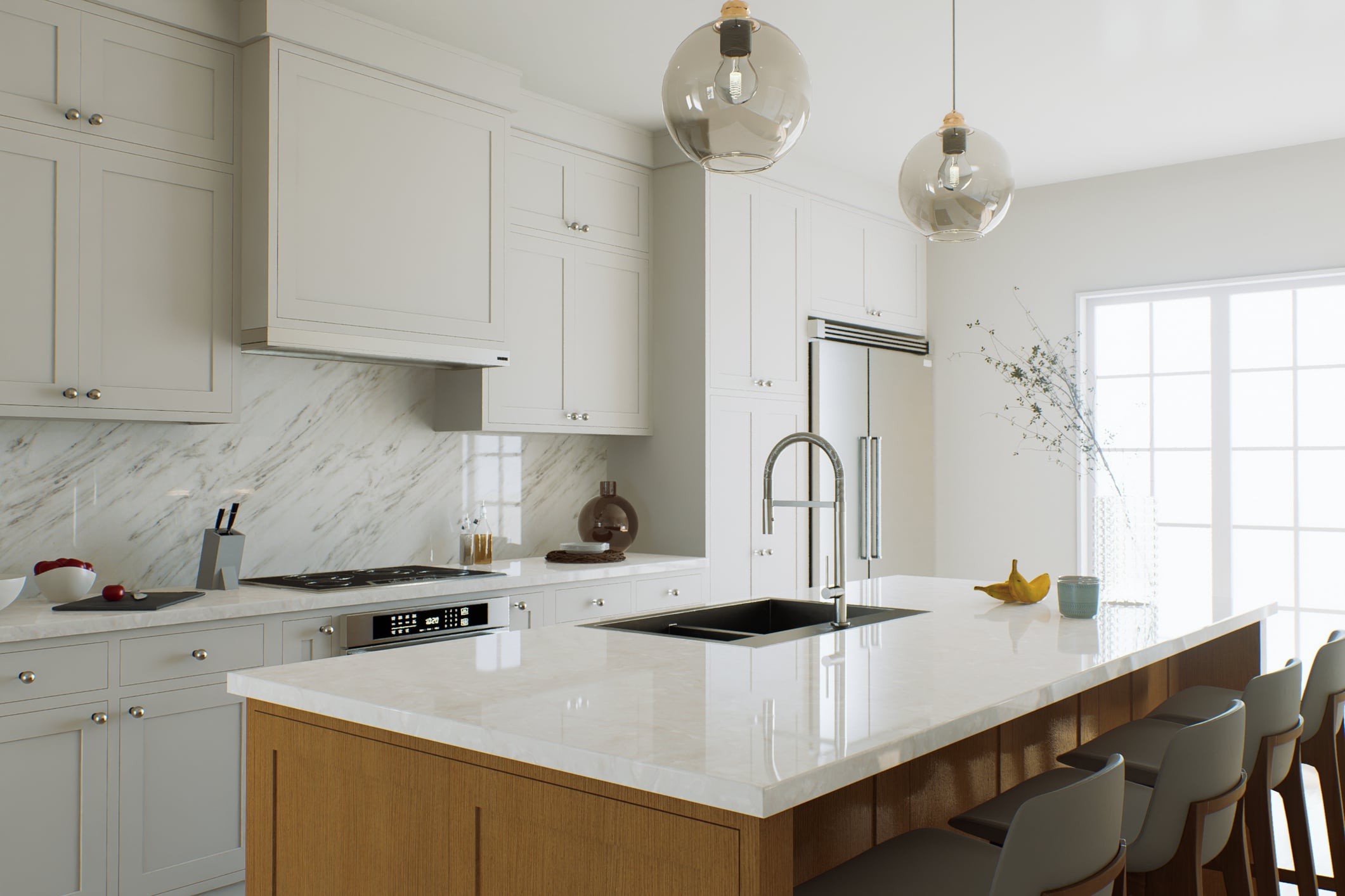
The harsh days of all-white kitchens are hitting the wall. By 2026, this clean, minimalist aesthetic may feel less elegant and a relic of a colder, less personal time. As winter approaches, homeowners are moving away from the “white” look for something with real soul. This change is not just a trend. It’s about survival. As the sun sets earlier and the air gets colder, you don’t want to cook in a space that looks like a hospital waiting room. You want warmth. You want personality. Once the undisputed king of modern design, white kitchens are now quietly giving way to richer, more atmospheric hues, turn the heart of the home into a sanctuary rather than a showroom.
Зміст
Why does a white kitchen feel cold in winter
White has been a safe choice for years. It screams modernity. reflects light. Easy to combine with almost anything. But if you take a closer look at today’s design showrooms, you’ll notice a sense of fatigue. All-white kitchens suffer from specific problem in late fall and winter. it amplifies the grey light of the season without offering any counterbalance.
The end of sterile minimalism
The problem is not that white is ugly. It just lacks personality. In winter, an all-white kitchen can feel sterile. It drains energy from the room. Homeowners are actively looking for a relaxing atmosphere. They want their kitchens to feel like a hug, not a blank canvas. The collective desire turned towards chaleureux (warmth) and a unique identity. We are tired of spaces that look perfect in photos but feel empty when you’re actually standing in them making dinner. A white kitchen demands perfection, which is tiring. A colored kitchen forgives more. It feels lived-in.
Desire for depth and individuality
The current design zeitgeist is about texture and depth. People want materials that age well and look good after use. Think raw linens, unglazed ceramics and warm wood. White doesn’t age. It just gets dirty. Colors like beige, sage green and deep blue can envelop a room. They create a feeling of well-being, which is essential in the gloomy season. You need a kitchen that reflects our need for comfort, not just our desire for cleanliness.
2026 Color palette: beige, sage green, dark blue
The revolution isn’t a sudden explosion of neon lights. It is a sophisticated retreat into natural, grounding tones. These colors are more than just paint patterns. they are tools that changes the mood of your kitchen. Here is what is taking over in 2026.
Beige: the new neutral color
Forget pure white or cold gray. Beige is the new neutral and it’s everywhere. You will see it in the latest collections of major retailers such as IKEA and Maisons du Monde. This isn’t your grandma’s beige either. The color is rich and textured, evokes light wood, raw linen and unpolished stone.
Why it works: Beige can warm up a room without saturating it. It creates a soft, felt-like atmosphere. Goes well with heavy textiles, heavy rugs and brass lighting fixtures. If you’re thinking of a refresh, beige cabinets and walls can provide a elegant backdrop for seasonal dishes and festive accessories without overwhelming the senses. It is chic. It is understated. And it feels expensive.
Sage green: Natural calm
Sage green is surging. it brings that quiet of the outdoors indoors with the colors of winter’s dormant nature. It is not the bright green of grass. It is muted, dusty and has an incredibly soothing atmosphere. It connects the inner and outer worlds and reminding you of herb gardens and fresh cuts even when we are stuck inside.
How to use it: Sage green is most effective when combined with natural materials. Think wood accents, cotton, rattan and handmade ceramics. Create a bridge between your kitchen and the rest of your home. It’s soothing. It can reduce stress. If you spend time in the kitchen, you understand the psychological benefits of color, which does not need to attract attention and gives a stable and even presence.
Dark blue: great depth
Blue used to be the color of summer. Those days are over. Navy blue is making a comeback, especially in high-end catalogs like Zara Home. It adds sophistication that can’t be achieved with white. It brings depth and drama to spaces that might otherwise be too safe or boring.
Change: Pair deep blue with brass hardware, bright countertops, or leather handles. Transform your plain white kitchen into a bold and inviting space. Perfect for cold nights. The contrast between dark walls and warm lighting creates a cozy and intimate atmosphere. This is an architectural choice. It defines the space.
Make changes practical
Removing whiteness requires a strategy. You don’t have to dismantle the cabinets tomorrow. However, you need to start thinking in layers.
- Start with textiles. Replace white dish towels with beige linens. Add green sage sprigs.
- **Update your hardware. ** Brass or matte black handles can change the look of white cabinets, while colored cabinets can change the whole room.
- **Lighting is very important. ** Light bulbs (2700K) are not negotiable in the colorful kitchen. White walls reflect light. Colored walls absorb it. We need compensation.
The question is not whether these colors last; they already have it. The question is, can we relinquish the control of whiteness? White is as expected. Beige, sage and blue are vibrant. They change as the light changes. You can see the wear and tear. they tell stories.
We live in a time where comfort is more important than perfection. The white kitchen is not over, but its reign is coming to an end. The new time is warmer. The situation is even more confusing. It’s more humane. It feels like home.
Switch from sterile white to warm tones on a budget
Of course, an all-white kitchen is calming. But in January they feel sterile. It’s like a hospital waiting room. A complete overhaul is not needed to solve this problem. We need contrast. You need layers.
Let’s start with the wall. Select a wall. Just one. Paint it beige, sage green or navy blue. Don’t paint the whole room. One wall creates depth. It improves the atmosphere without making the room small or dark.
If painting feels like too much work, leave the walls out. Replace the cabinet doors. This is the easiest way to add personality. You aren’t knocking out the drywall or rewire the outlets. You are swapping panels. It’s low effort, high impact with little effort.
Then fill in the gaps with accessories. Avoid buying pure white dishes. Buy colorful plates. Use seasonal textiles. Think linen dish towels. Woven table mats. Luminaires made from vegetable fibers. Swap out standard handles with a brass or ceramic handle. These small changes add up over time. They change the atmosphere.
And look at your appliances. That old white toaster? Replace it. Get a cream-colored kettle. Sage green toaster. A navy blue robot. Small appliances are cheaper than cabinets. They sit out all day. They set the tone.
These are budget-friendly transitions. But you can prevent your kitchen from descending into winter monotony.
What pitfalls should be avoided when implementing colors?
Changing from pure white to color is difficult. It’s easy to do too much. Here is where people mess up.
**Too many colors. ** Don’t throw five different hues on your wall. It looks chaotic. It’s busy. In winter, you want peace, not a carnival. Choose an accent color or two. Stay with them.
Ignoring texture. The color needs a surface to live on. Flat paint on flat plastic looks cheap. Add warmth. Use warm wood. Rough ceramic. Thick, natural textiles. These materials absorb light differently. They make the color look rich.
Forgetting the light. Natural light changes everything. Beige makes a small, dark kitchen feel brighter. Navy blue looks incredible in a sunny space. Sage green blends perfectly with garden landscapes. In addition to your mood board, also try the color of the windows.
Skipping seasonal accents. Winter decoration is not just about color. It’s about texture and nature. Dried bouquets. Pinecones. Natural linen tablecloth. These items wake up the decor. They remind you it’s winter.
What this shift says about your lifestyle?
Why are beige, sage and navy so popular right now? This is not random. This is a reaction. People want to connect with what matters. They want their kitchen to feel like a Spaces to live. Not just places to cook. Spaces to live.
These colors represent the desire for warmth. For personalization. It’s an environmentally friendly choice. You don’t need a big budget to achieve this. All you need is style. Comfort needs to be increased. Why not add a little poetry to your everyday life?
This increases the fun time. That long winter evening. family dinner. A friend is coming. The kitchen should support this.
Rethink your color palette. Choose a warm beige color. A peaceful recluse. Refined deep blue. It’s not just about following trends. It takes up the most important room in the house. It adds authenticity.
Winter nights are long. Your kitchen doesn’t have to look like this.
Are you ready to make it your own?